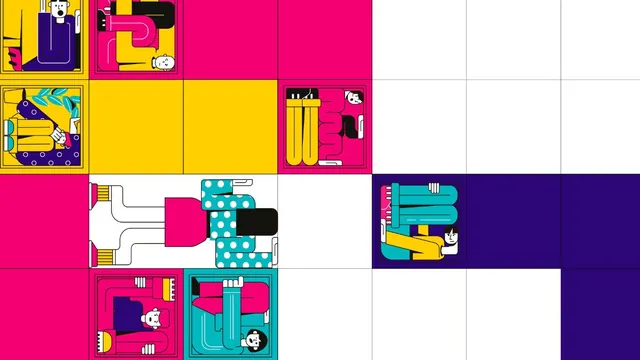

"Let's put everything on the first screen! The huge logo, our three offers, the contact form and a video too, so the user sees everything at once and doesn't have to scroll!"
I've heard this at almost every project kick-off in my career. Spoiler: it's the best way to create total confusion and make anyone who lands on your website run for the hills.
Behind messy, anxiety-inducing, overloaded layouts there is a myth we have stubbornly carried with us since the '90s: the obsession with Above the Fold.
Why you should stop cramming everything at the top
If you want to build a website that converts and guides users naturally, you have to let go of this old logic. Here is why Above the Fold has lost its original meaning, explained in 3 simple steps.

1. A legacy of print
The term "Above the Fold" comes from newspapers sold at newsstands, where the main story and the cover photo had to sit in the top half of the folded page to catch the eye of passers-by. But the web isn't a piece of paper, and screens aren't all the same. Today the "fold" (the bottom edge of the screen) varies enormously: from a tiny smartphone to a gigantic 34-inch ultra-wide monitor.
2. Scrolling as a reflex
Thanks to platforms like Instagram and TikTok, and to our everyday use of smartphones, scrolling down has become the most instinctive and natural physical action we perform. Tracking data and heat maps show beyond doubt that users start scrolling before they've even finished reading the main headline.
3. The visual paradox
If you frantically try to squeeze all the information into the first few pixels at the top, you automatically remove the breathing room between elements. You build a real "visual wall" that creates anxiety and a huge cognitive load. Users feel overwhelmed and, instead of calmly reading your proposal, close the tab in irritation.

The real role of the Hero Section
Careful: here's an important detail! The first screen (known in the jargon as the Hero Section) is fundamental, but its job isn't to sell the entire catalogue in exactly 3 seconds.
The Hero Section should work like a book cover. It has to hook attention, explain your value proposition clearly and concisely and, above all, make people want to scroll down to discover the rest of the story. Give your content room to breathe, let the visuals speak and allow users to explore your website naturally, without constraints.