"There's too much empty space on this page! Let's pull the text closer, add a bigger photo, and fill this white hole!"
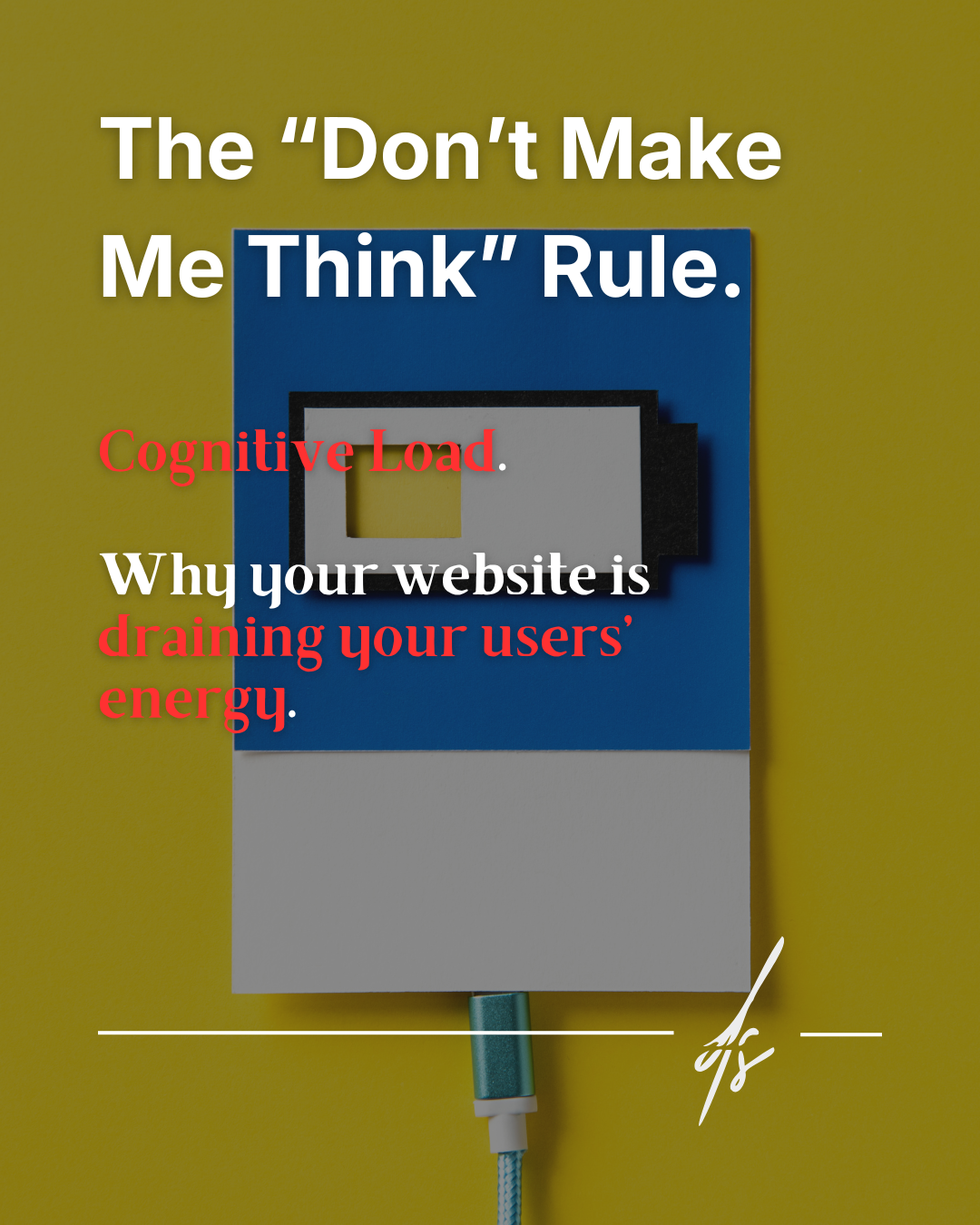
This is a phrase I've heard countless times. I get it: if you're paying for a website, instinct tells you to use every single pixel available to sell or inform. But the reality is different: filling every void is the best way to create a sense of digital claustrophobia and drive your users away.
The psychology of perception: Gestalt and breathing room
Behind an elegant and easy-to-navigate site, there isn't just "good taste," but a principle of Gestalt psychology called the Law of Proximity, combined with a masterful use of so-called White Space.
It's not about being "minimalist snobs." It's about respecting how the human eye deciphers information. Here is how this invisible process works in 3 fundamental steps.

1. Automatic Grouping
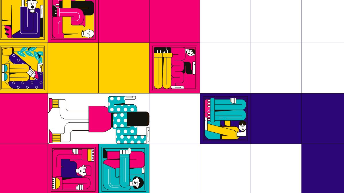
Our brain is a machine that tries to save energy. To quickly understand a web page, it assumes that elements close to each other are part of the same visual and logical group. Without white space to separate blocks, the user cannot distinguish where one concept ends and another begins.
2. The Horror Vacui Error
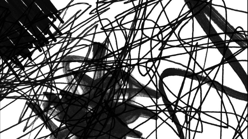
Giving in to the anxiety of filling every space — a phenomenon known as Horror Vacui — and sticking titles, texts, and buttons to each other sends the user's brain into a tailspin. When everything "screams" for attention at the same time, nothing receives attention. The user no longer understands what they should read first and ends up reading nothing.
3. Visual Oxygen
Empty space between elements is not "wasted" space that you could have used to insert another banner or another paragraph. It is the tool that gives structure, order, and, paradoxically, importance to what you have written. It works exactly like pauses in a speech: without pauses, your words are just an indistinguishable noise.
A fundamental detail: white space is not "white"
A common mistake is thinking that White Space must be white in color. In reality, in design, we call it Negative Space: it indicates any area of the graphics without active elements. It can be black, deep blue, red, or a complex gradient.
The color is not important, but its function is: it must let your main content "breathe." Remember this next time you look at a graphic draft and it seems "empty": that void is what will allow your customers to read, understand, and, finally, click.