
"Put the main menu and the buy buttons in the top left corner, it's the web standard!"
This is a statement heard constantly in corporate design meetings. But the reality hides a bitter spoiler: on modern smartphones, the top left corner is absolutely the worst place you could position an action that is important for your business.
Anatomy and usability: the origins of the Law
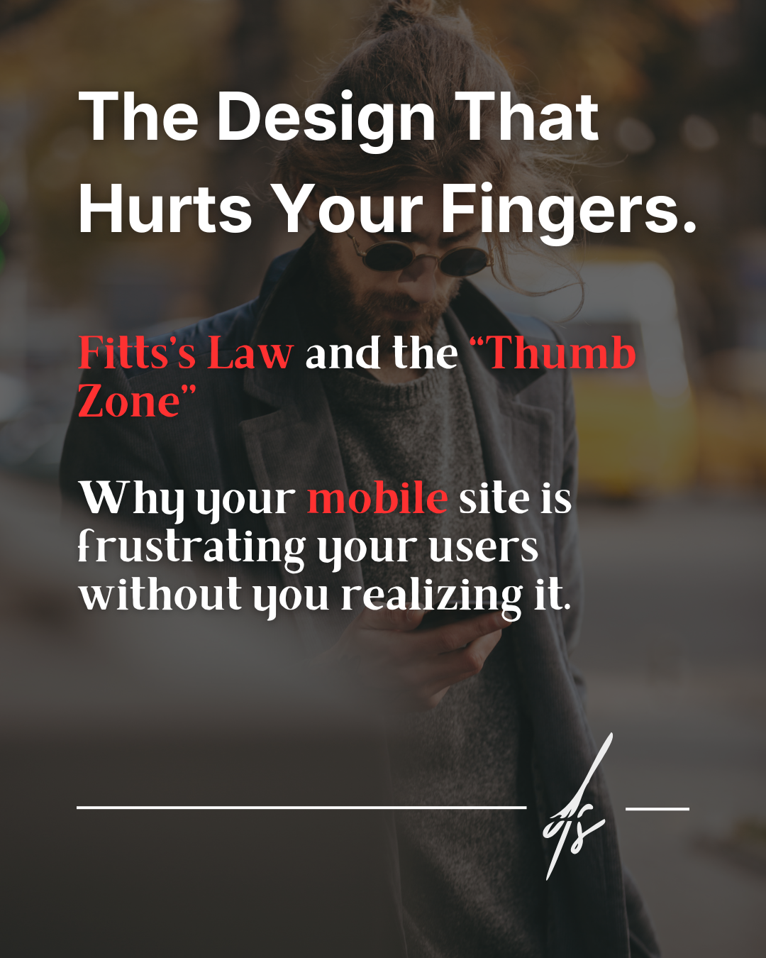
Behind a mobile app or site that feels pleasant and natural to use, there isn't just good aesthetic taste. There is a scientific and mathematical rule formulated back in 1954 by psychologist Paul Fitts: Fitts's Law.
This principle states, in simple terms, that the time required to rapidly move to a target area is a function of the ratio between the distance to the target and the width of the target. The further and smaller a button is, the harder it will be for the user to click it. Translated into today's world of smartphones, this law becomes the fundamental pillar of mobile design.

Physical reality and design friction
To correctly apply this principle to Web Design, we must analyze the interaction between humans and devices across three critical points:
1. Hardware reality
Mobile phone screens are getting larger every year, but our hands remain the same size. Behavioral data proves that the vast majority of people use their smartphones by holding them with one hand and navigating the interface using only their thumb.
2. Invisible friction
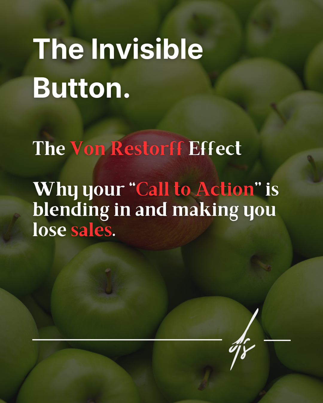
If you place your Call to Action (the button to buy, subscribe, or contact) or the main menu icon at the top of the screen, you are forcing your user to perform literal contortions with their thumb, or to use their other hand to complete the action. This is a micro-frustration. And accumulated micro-frustrations cause sales to plummet drastically.
3. The solution: designing for the thumb
The solution is to move all key actions into the so-called Thumb Zone (the thumb's comfort area), which is the lower half of the screen. Following Fitts's Law, the golden rule is simple: the more important the button is to your revenue, the larger it must be and the closer it must be to the natural resting position of the user's finger.
Tech giants already know this
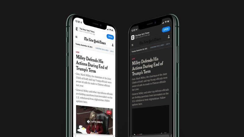
There is a fundamental detail that confirms this theory: it is no coincidence at all that Apple recently overhauled Safari's design by moving the entire address and navigation bar to the bottom.
If you pay attention, all the apps you use most frequently during the day (like Instagram, Spotify, or TikTok) have their entire main navigation comfortably placed within thumb's reach, in the bottom band of the screen. They have understood that physical comfort and ergonomics translate directly into time spent on the app and conversions. When you design for mobile, stop looking at your computer screen and start looking at your hands.


