"Let's make a super complex design, full of abstract icons and micro-animations on every single element, to show clients how creative and cutting-edge we are!"
Spoiler alert: if you apply this mindset to the design of your website, you won't prove your genius. You will only prove how quick and easy it is to drive a potential customer away to your direct competitors.
The Golden Rule: Don't Make Me Think
Behind every truly successful digital product lies a rock-solid golden rule, made famous worldwide by usability pioneer Steve Krug in his timeless best-selling book: "Don't Make Me Think".
This mantra is not just a slogan; it is based on a psychological concept deeply rooted in human behavior, called Cognitive Load. To understand how vital it is to apply this rule to your online projects, let's analyze the user journey in 3 fundamental steps.

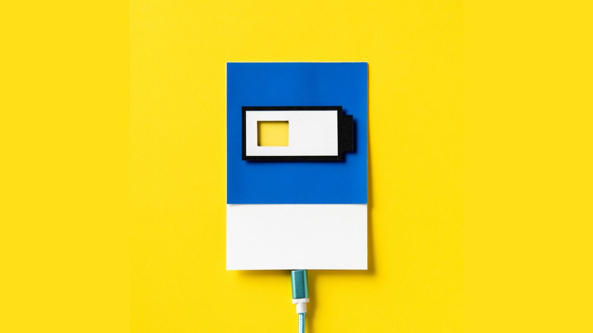
1. The user's mental battery
Our brain has a limited reserve of energy dedicated to conscious attention and problem-solving. When a user lands on your site for the first time, they want to invest that energy exclusively to evaluate your product or service. They do not want to use it to figure out how your website works.
2. The symptom of overload
What happens when we try to be too original? Imagine using bizarre labels for your navigation menu (for example, "Our Universe" instead of the clear and reassuring "About Us"). Imagine buttons with unusual styles that don't even look clickable, or copy so stuffed with technical jargon that it becomes unreadable.
Every time you make one of these choices, you force the user to stop and think. In that exact moment, you have dramatically increased their Cognitive Load, unnecessarily draining their precious "mental battery". Frustration rises, and a click on the infamous "X" to close the tab gets closer.
3. Design Transparency
Perfect design is literally invisible. It is the design that preemptively removes every visual obstacle, every tiny doubt, or moment of indecision. If, while navigating your e-commerce or portfolio, the user stops for even a second to ask themselves "Where do I click now?" or "What exactly does this abstract icon mean?", your design has failed its primary mission.

Clarity doesn't mean boring
A crucial detail to carve into the mind of every designer and entrepreneur: being extremely clear absolutely does not mean being boring, cold, or trivial!
It means using innovation to simplify people's lives, not to complicate them in the name of pure aesthetic exercise. Use visual conventions that people have already assimilated by browsing elsewhere. Write direct copy, eliminate superfluous words, and make your main actions (the Call to Actions) large, high-contrast, and impossible to misunderstand.
In a nutshell: make your interface "foolproof". No offense to anyone, but the frantic rush that dominates the web today makes us all slightly less lucid, hasty, and ruthless users. Simplify your design, and watch your conversions skyrocket.