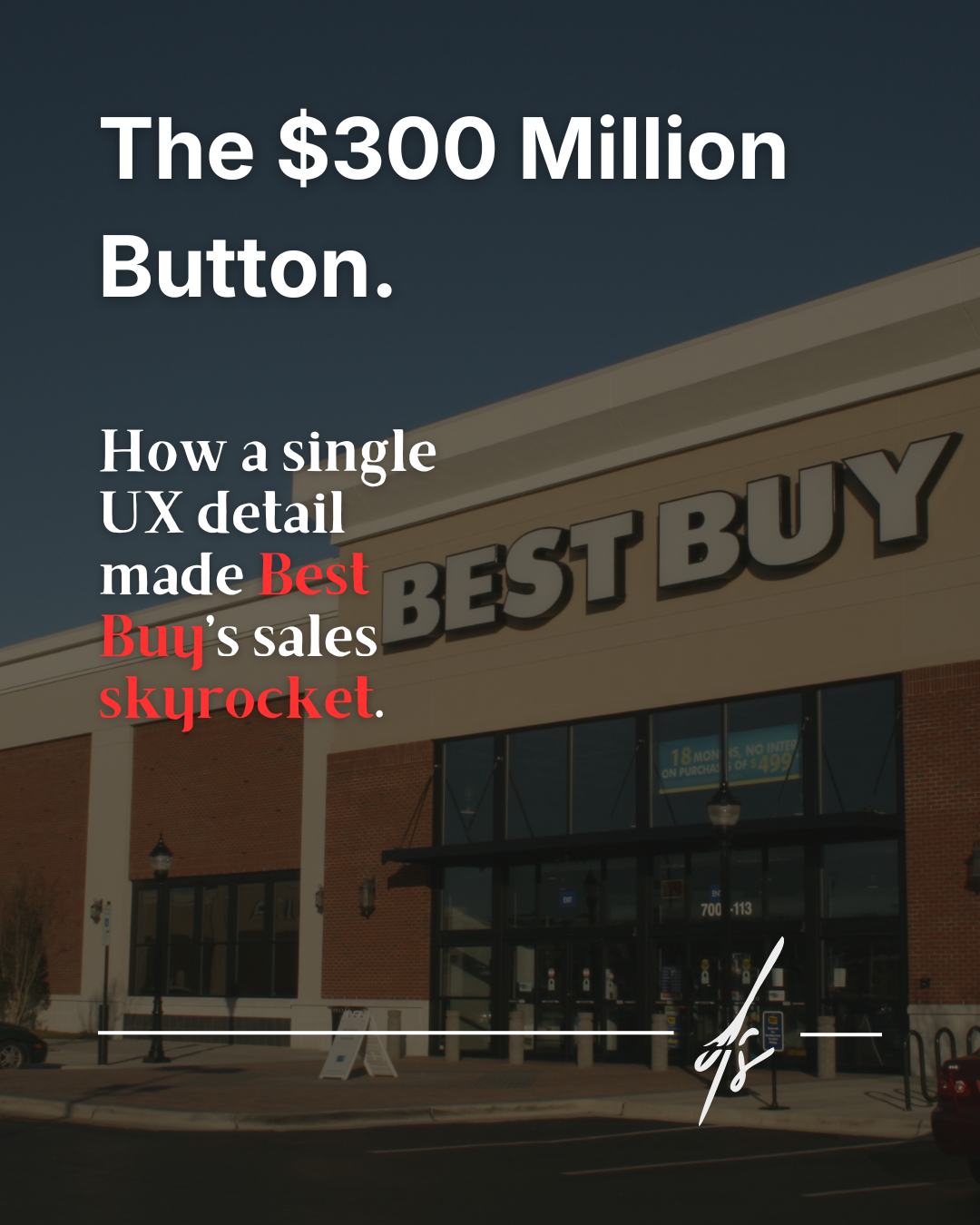
"Let's make the 'Buy' button the exact same color as the brand, so everything looks elegant and perfectly coordinated!"
This is one of the most common phrases heard during design meetings or when drafting creative briefs. While the desire to maintain absolute visual consistency is perfectly understandable, it is also the best way to make your button completely invisible to the user's eye.
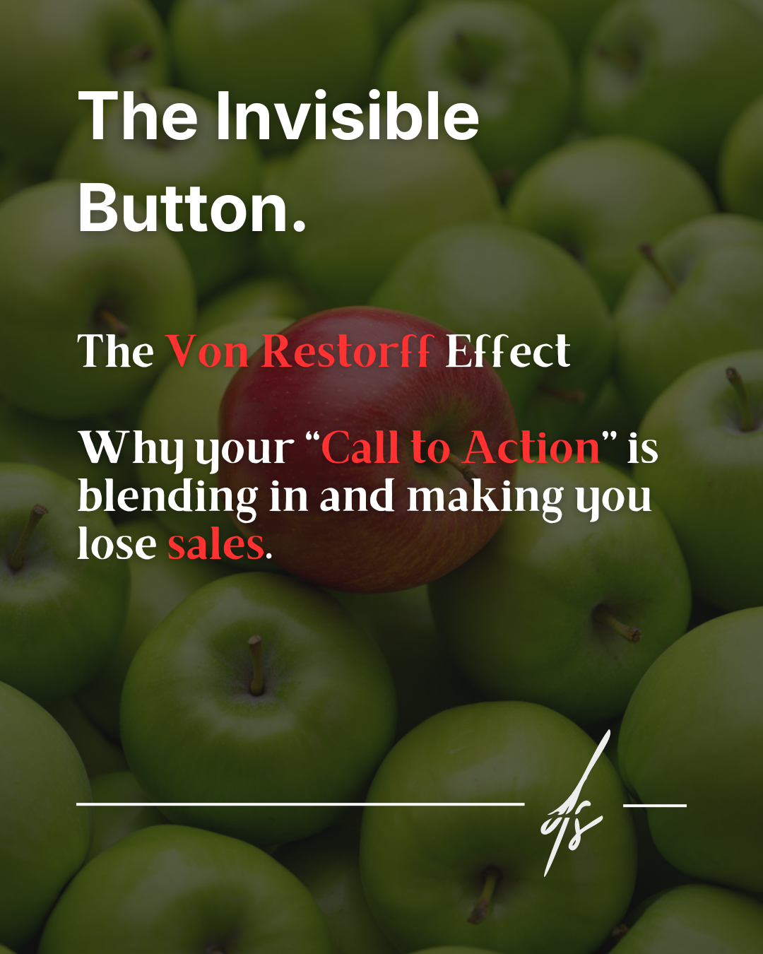
The psychology behind conversions: The Isolation Effect
Behind a webpage that truly works, successfully guiding visitors and converting them into customers, lies a powerful psychological principle discovered back in 1933 by the German psychiatrist and researcher Hedwig von Restorff: the Von Restorff Effect, also known as the Isolation Effect.
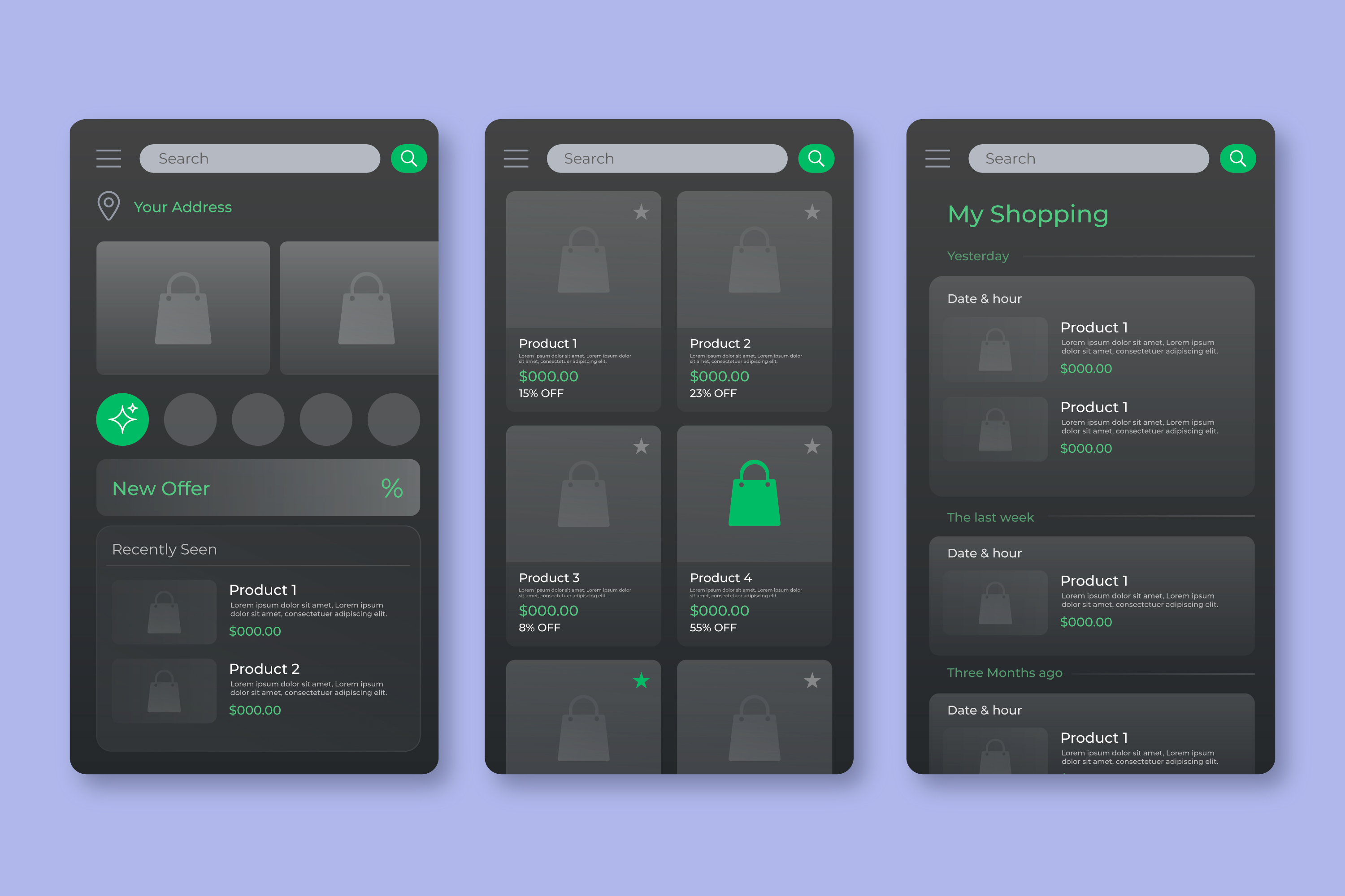
This principle states that when an individual is presented with multiple similar stimuli or a homogeneous group of elements, the element that visually differs from the rest of the group has a much higher probability of being remembered, noticed, and clicked. It is not about ruining the aesthetics of a website, but about using color, size, and shape to channel human attention in a scientific and targeted way.
The biology of attention and cognitive load
Our brain is biologically programmed to scan the surrounding environment in fractions of a second, looking for anomalies. This survival mechanism leads us to immediately notice only what breaks the visual pattern. By applying this concept to User Experience, we reduce the user's cognitive load: they don't have to "search" for the action to take, because the action itself attracts their gaze.
Imagine your corporate website is dominated by cool colors, like navy blue or slate gray. If you use the exact same blue for the most important button on the page (the so-called Call to Action), you are literally camouflaging your request. The distracted user won't spot it at a glance. The result? No clicks, and a potential sale or valuable lead lost forever.
The solution: Contrast and Accessibility
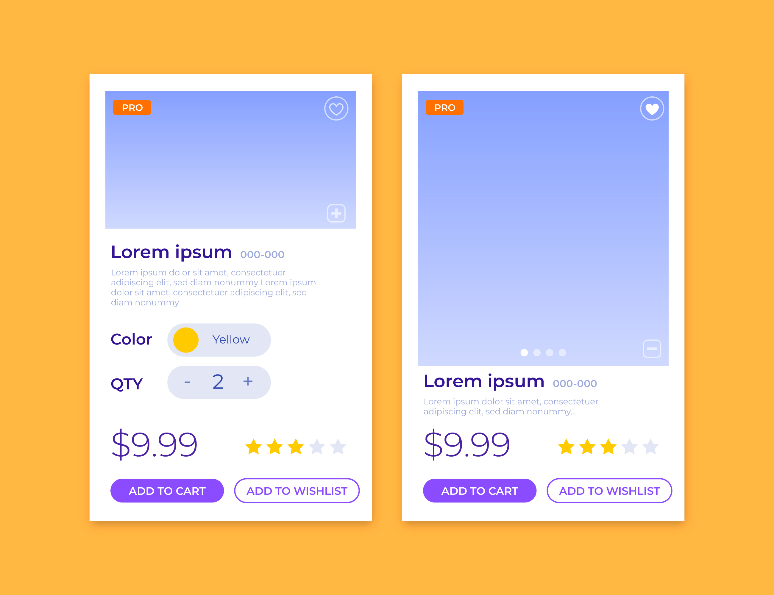
The button that generates profit or triggers the main action (such as "Buy", "Request a Quote", or "Subscribe") must have a sharp contrasting color compared to the chromatic ecosystem in which it is placed. This brings us to another crucial factor in modern web design: accessibility.
Creating adequate contrast is not just a marketing trick, but a fundamental requirement to ensure that the interface is navigable by everyone. The Web Content Accessibility Guidelines (WCAG) recommend specific contrast ratios to ensure that the text inside the buttons is clearly readable even by users with visual impairments or on screens with low brightness.
A detail of vital importance: creating contrast does not mean using random neon colors and ruining the harmony of your project. The secret of a good UX Designer is to carefully study complementary colors. If your brand is primarily blue, an orange or mustard yellow button will create a flawless chromatic harmony. The design will look sophisticated and elegant, but at the same time, that button will unmistakably stand out on the page.
Always remember a golden rule in UI/UX Design: extreme elegance becomes useless if the user feels lost and doesn't know where to click.
Do you suspect your interface has camouflaged buttons that are lowering your metrics? Contact me for an analysis and let's discuss how to optimize your conversions.