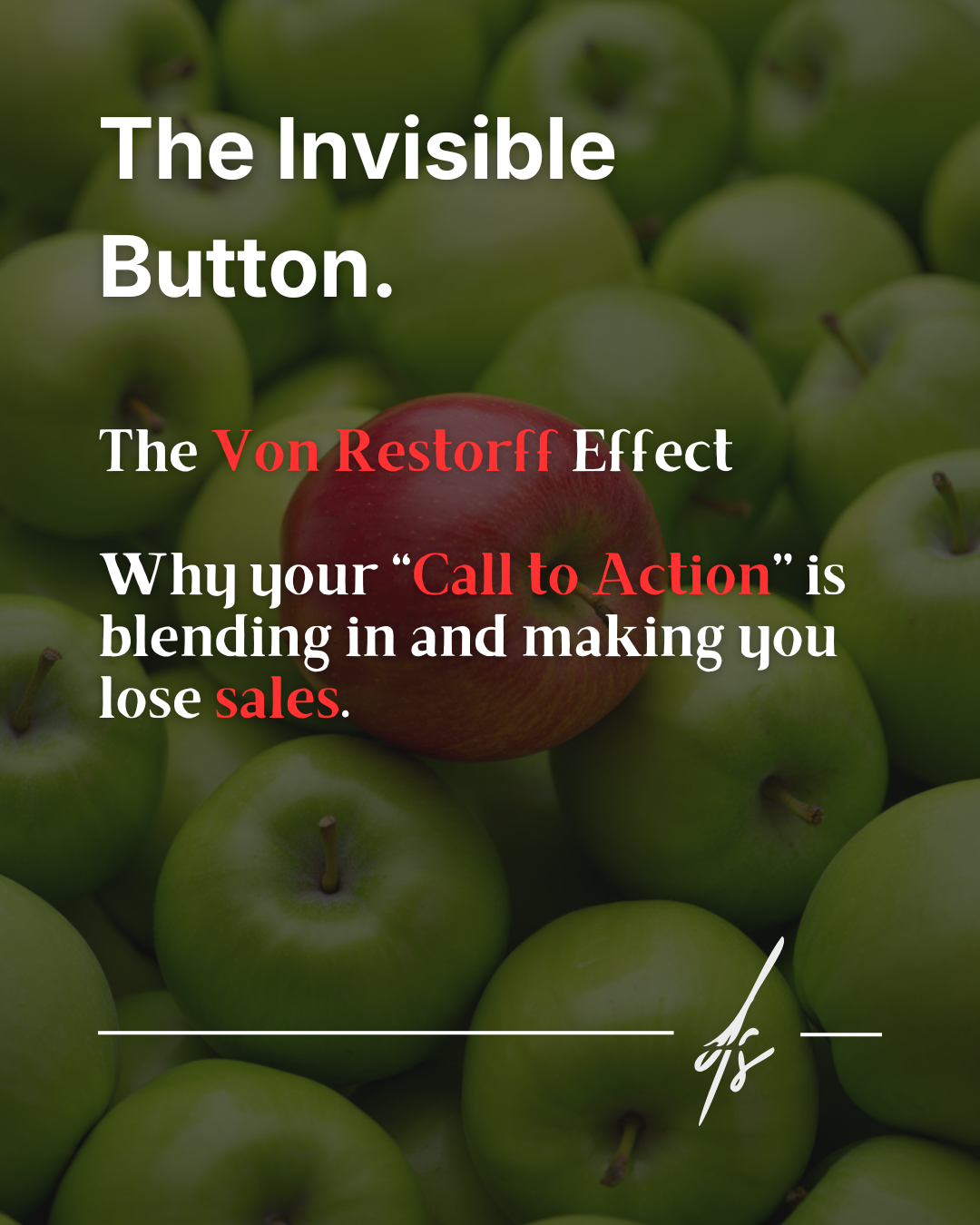
Everyone thinks that skyrocketing e-commerce sales requires extremely complex funnels, crazy discounts that wipe out profit margins, or massive advertising campaigns. Often, however, all it takes is simply removing a formal obligation.
Behind an abandoned cart, there is almost always a profound psychological friction. The most famous case study in the history of User Experience, meticulously analyzed by usability expert Jared Spool, teaches us exactly this vital lesson.
The problem: the registration hurdle
It all started when an e-commerce giant realized they were struggling terribly to convert new users. The analytics showed a frustrating scenario: people browsed enthusiastically, filled their shopping carts with dozens of items, but then abandoned the site at the critical moment of checkout.
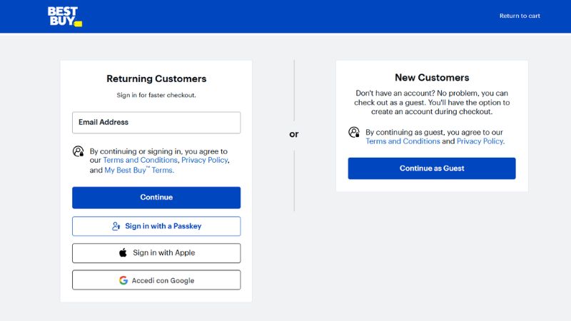
The reason was hidden in the design of the purchasing flow. Before users could enter their payment details, the system forced them to fill out a form with a peremptory message: "Register to continue." Designers and developers thought it was a normal step to build customer loyalty and collect data, but new users experienced it as an insurmountable barrier. The cognitive load and the perception of having to do unexpected "work" were simply too high for individuals who only wanted to complete a quick purchase.

The action: the power of guest checkout
The architectural solution applied by the User Experience team was as simple as it was brilliant: they decided to completely remove the registration requirement. In its place, the form was streamlined, and a single button was introduced with the text "Continue as Guest".
Accompanying this new button was a reassuring and transparent message, explaining to visitors that it was absolutely not necessary to create an account to complete the transaction (offering, of course, the optional choice to save their data later). This small, surgical change shifted the entire focus of the website: from corporate needs (the indiscriminate collection of user data) to consumer needs (buying stress-free and quickly).
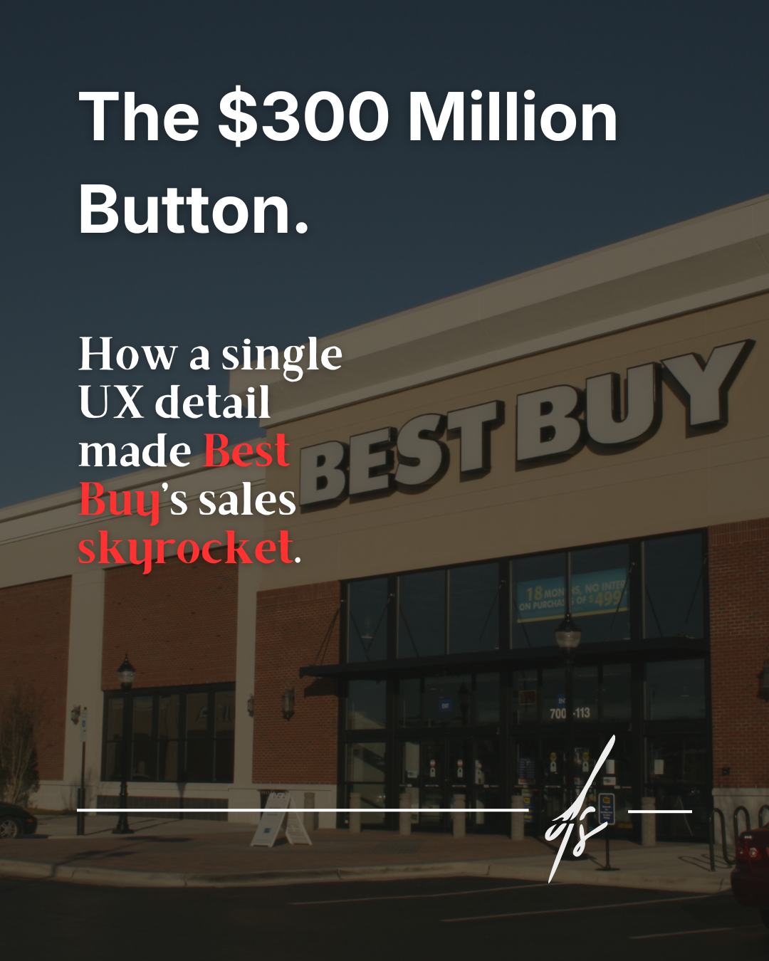
The result: $300 million in extra revenue
The results measured in the following weeks literally made Web Design history, becoming a subject of study around the world. The number of new buyers increased by 45% during the very first month of implementation.
Projecting the data over the long term, in just one year that single, seemingly marginal technical modification managed to generate a staggering $300 million in extra revenue for the company's coffers. All generated by a simple button and the removal of an invisible wall.
Usability means removing obstacles
This historic case study leaves us with a formative principle of inestimable value: never ask users to do unnecessary "work" before ensuring they get the value they are seeking. Information architecture must facilitate the process, not complicate it.
As constantly reminded by the Nielsen Norman Group, the global authority on digital research and usability, good UX is not limited to making interfaces aesthetically attractive. True Design is the art of subtraction: it is about recognizing and removing friction, breaking down cognitive barriers, and invisibly paving the shortest, most pleasant path that separates a user from their final goal.