"Let's put a nice long text on the homepage to tell the whole story of our company from 1990 to today!"
This is one of the most frequent requests a Designer hears during initial client briefs. And while corporate pride is more than justified, the reality of the situation requires a painful spoiler: almost no one will read that endless block of text.
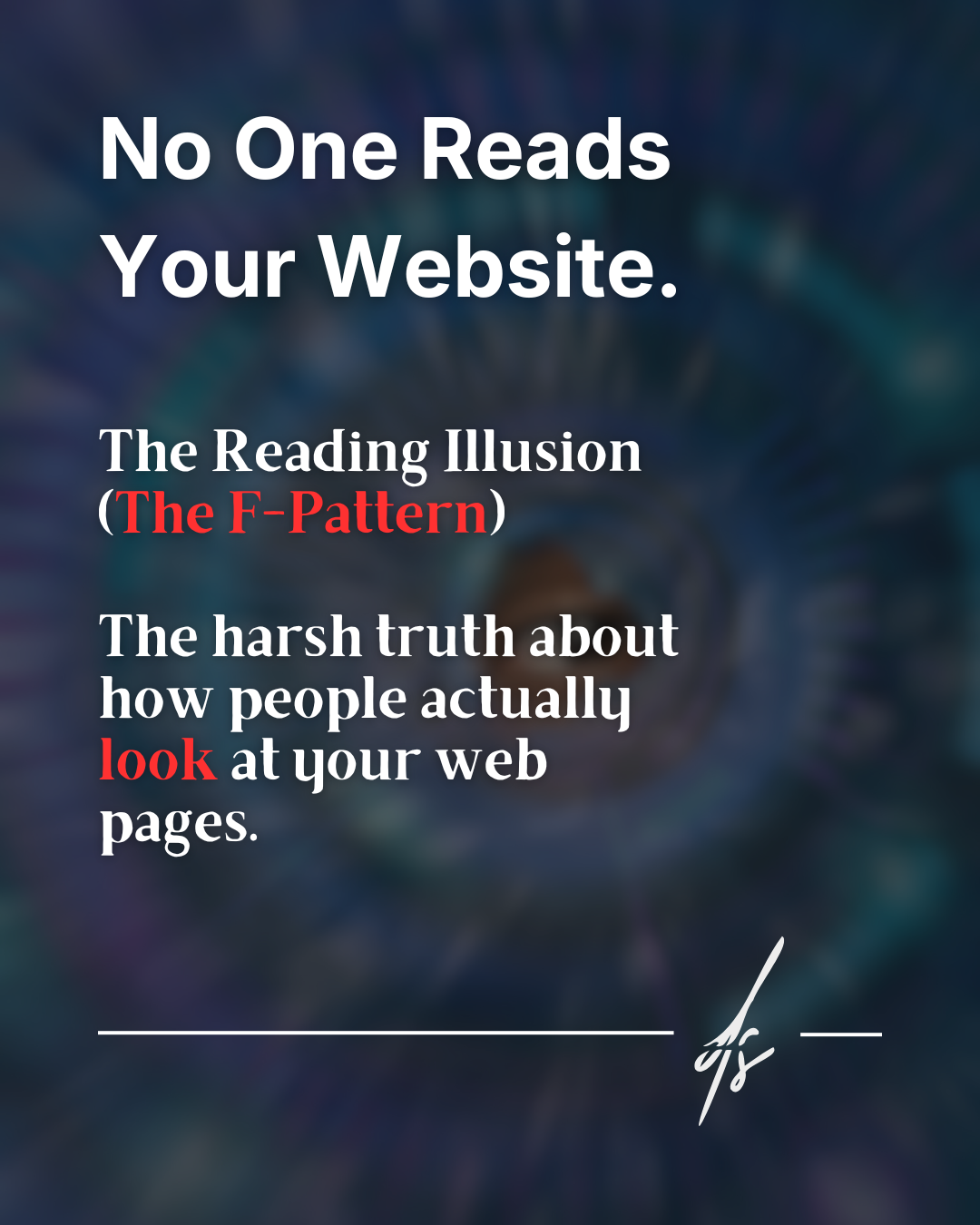
Digital survival and Eye-Tracking
Behind a website capable of converting visitors into paying customers lies a deep and rooted understanding of how human attention works in the digital age. The harsh empirical reality boils down to a concept widely documented in usability fields: the F-Pattern.
It is not a matter of laziness on the part of users, but a genuine digital survival mechanism. Every day we are bombarded by millions of stimuli and pieces of information. Consequently, our brain has learned to filter content at a frightening speed. Pioneering Eye-Tracking studies conducted by the Nielsen Norman Group have demonstrated exactly how our eyes move across a web page.

How your users read in 3 steps
Understanding the visual behavior of your target audience is the first step to stop wasting words and start driving clicks. Here is what actually happens when a user lands on your homepage:
1. The bitter truth: visual scanning
People online do not read word for word; instead, they "scan". They are in a hurry, their time is limited, and they immediately look for a visual anchor that suggests a solution to their specific problem.
2. The F-shape
Visual tests show an unmistakable heatmap: the human eye explores the screen forming a giant letter "F". The user carefully reads the top headline (the first horizontal line), quickly moves down the left margin of the screen, pauses on a subtitle or a bullet point (the second, shorter horizontal line), and finally scrolls away quickly downwards, abandoning structured reading.
3. The graveyard of words
What happens to all that compact, grammatically perfect text you placed on the right side of the screen or wedged into the center of a huge text block? It gets ignored. To your user's brain, unaccustomed to prolonged effort, that area is practically invisible.

The solution: Visual Copywriting and Cognitive Load
A detail of vital importance: this behavior does not mean at all that Copywriting (your website's text) doesn't matter. On the contrary, it matters so much that you are obligated to make it immediately digestible and aesthetically inviting.
Presenting endless walls of text generates a very high cognitive load. The user perceives the mental effort required to process the information as excessive, gets stressed out, and, in the vast majority of cases, closes the tab to move on to your competitor's site.
The real solution lies in proper editorial and typographic formatting. Structure your texts with short paragraphs of a maximum of 3 or 4 lines. Make extensive use of bullet points to break the visual rhythm. Use bold text tactically, highlighting only essential keywords, allowing the scanning eye to grasp the meaning of the entire sentence by landing on just three words. Design is not just colors and shapes; it is the visual organization of information.