"Let's put all 20 registration questions into a single form, so the user does everything at once on one page and doesn't get stressed!"
I have heard this strategy proposed many times during the development of new websites or apps. And while the logical intent to simplify the flow is admirable, the truth in terms of User Experience is exactly the opposite: presenting an endless wall of questions is the best way to make the user run away as fast as possible.
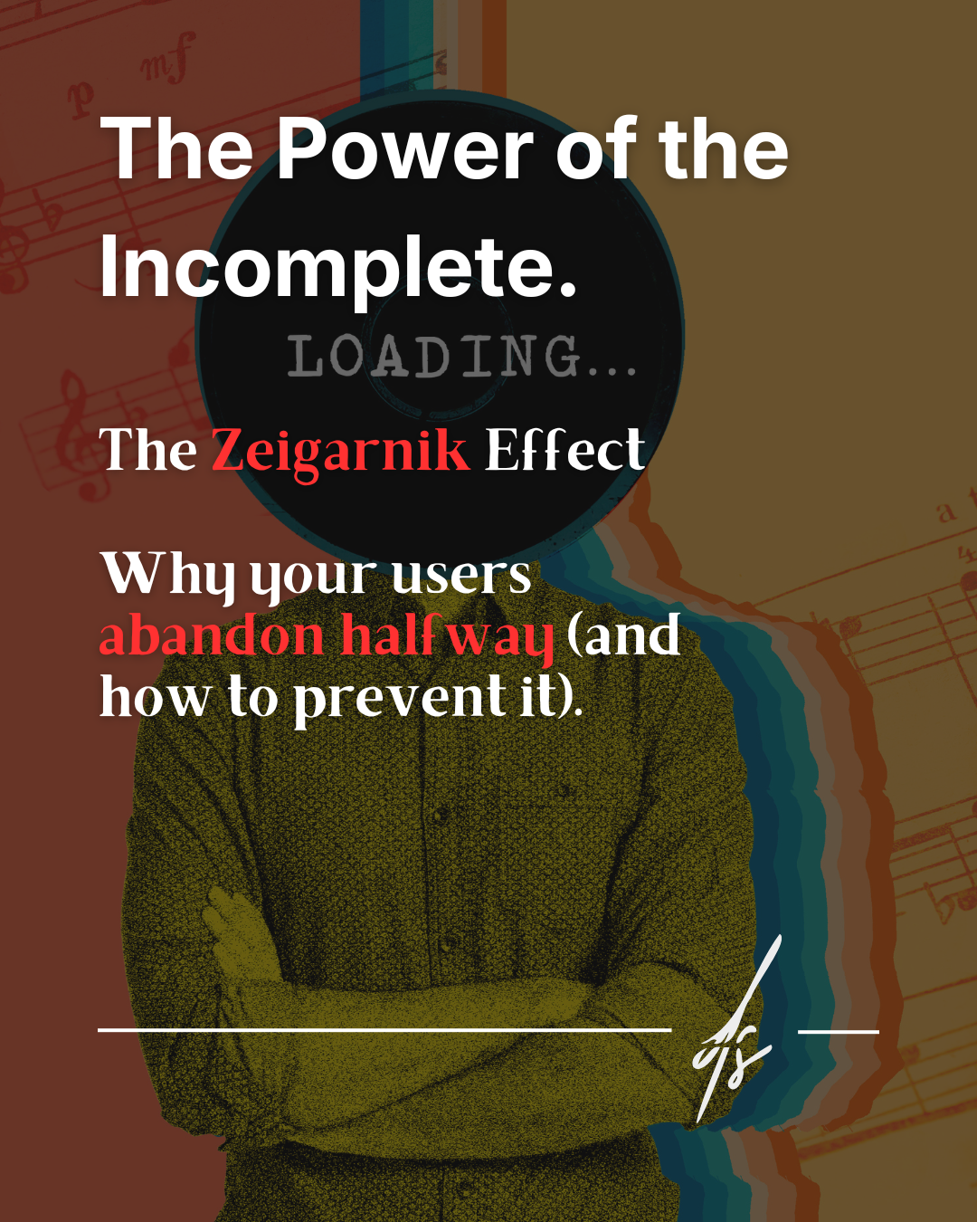
The psychology of the unfinished: The Zeigarnik Effect
Behind smooth purchasing processes and applications that manage to keep us glued and make us complete long questionnaires, there is a fundamental psychological law discovered almost a century ago in a lively Berlin café by Russian psychologist Bluma Zeigarnik: the Zeigarnik Effect.
This theory postulates a fascinating principle: the human mind remembers interrupted or incomplete tasks with up to twice the intensity of those already completed. Our brain literally hates open loops and feels an almost physical need to "close the circle" to find cognitive relief.

Increase conversions in 3 steps
How can we exploit this psychological vulnerability to drastically increase the completion rates of our business forms? Here is the process divided into three strategic phases:
1. The block: managing cognitive overload
The human brain hates prolonged mental effort. Seeing an endless page full of empty fields, dropdown menus, and text boxes creates immediate cognitive overload. The user's unconscious thought is: "This will take forever, I'll do it later". In the digital world, "I'll do it later" equals a user lost forever.
2. The trick: the memory of pending tasks
As Dr. Zeigarnik teaches us, our brain also hates tasks left half-done. Once a user has started a process by investing initial energy, the idea of abandoning it generates a subtle but persistent cognitive dissonance. We must get them to take the first small step without scaring them.
3. The solution: divide and guide
The golden rule of form design is to break that endless form into 3 or 4 easily digestible small steps. Instead of asking for 20 pieces of information on one page, ask for 5 on four different pages. Always use a visible progress bar. When the user sees a visual indicator saying "Step 1 of 4 completed", the Zeigarnik Effect triggers instantly: they have started, invested time, and now feel the psychological push to reach the end to close the task.

The final trick: The Endowed Progress Effect
There is an extraordinary enhancement to this technique called the Endowed Progress Effect, widely used by the world's largest platforms.
The technique consists of "gifting" the user the first step. Imagine showing a completion bar already filled to 20% just because the user entered their email on the previous landing page, or simply for clicking "Start". By making them believe they already have an advantage and are closer to the goal than they actually are, the percentage of those who will reach the end of the form will increase drastically.
Effective Design does not impose effort, but creates the illusion of simplicity. Do you want to review the usability of the forms on your site so you don't lose any more customers? Take a look at my contact section.